
Case study
Happly Seeker
Turning grant funding from a research project into a pipeline.
Senior Product Designer · Feb 2025 to present · Product design, design systems, UX writing · B2B SaaS and AI

At a glance
Role
First and only product designer. Every screen and every component on the platform is my design. UX decisions on a few areas were made together with Rosie, the PM; the rest I owned. Later I also built the front end for the screens I designed.
Team
Rosie (PM), three engineers, and me. For the front-end work, one engineer and I paired on implementation.
Timeline
Feb 2025 to present. The Funding Journey and Document Library were designed in 2025 and built in summer 2026.
Status
Pre-launch. The front end is built and the back end is in progress. The marketing site, happly.ai, is live.
Front end
Built
Back end
In progress
happly.ai
Live
Scope
Seeker platform, HapplyOS (white-label), GrantGPT Chrome extension, design system, marketing site, all product copy, and front-end implementation of the design system and Seeker screens.
What changed
Replaced AI match percentages with a rule-based High, Medium or Low badge that is instant, consistent and explainable.
Built the Funding Journey pipeline: silent until someone commits, one capture modal from every entry point, real award values only.
Merged nine front-end pull requests in five weeks, built inside the team’s codebase with Claude as a pair programmer.
Redesigned happly.ai in Framer. Engagement up 170 percent.
What Happly is
Happly is a funding platform with two sides. On one side, Canadian business owners look for grants and funding programs they qualify for, assemble applications, and track what they win. On the other, the organizations that hand out that funding run their programs, review applications, and manage their members on a white-label version of the same platform.
I joined as the first and only product designer. The platform had grown feature by feature for a few years, which meant three visual styles, several half-finished flows, and a product that could tell you a program existed but could not tell you what to do about it.
9
front-end pull requests merged in five weeks, designed and built by me
170%
more engagement on happly.ai after the redesign
→
3 → 1
legacy visual styles merged into one component library, shipped as code
What I owned
I am the design owner for the whole platform, working directly with the PM, the CEO and the engineering team.
The Seeker journey end to end: onboarding, dashboard, opportunity discovery and matching, the Funding Journey pipeline, the Document Library, outcomes
HapplyOS, the white-label platform for funding organizations: members, applications and review, roles and permissions, the Education Center, events and bookings, reporting
GrantGPT, a Chrome extension that drafts and fills grant applications on external sites, and an AI Business Plan Builder
The design system, from three legacy styles to one component library, including the QA pass across every surface
happly.ai, the marketing site, designed and built in Framer
Product writing across all of it: empty states, locked states, match explanations, onboarding questions, error and recovery copy
I also wrote the product requirements for the Funding Journey and for the HapplyOS platform, then designed and built against them. In summer 2026 I took on the front end as well: the design system and the Seeker screens, implemented inside the team’s codebase alongside one engineer.
Discovery was never the hard part
When I started, the assumption inside the product was that founders needed to find more programs. That is not what was happening. A founder would open the platform, see a long list of opportunities with match percentages next to them, and either believe a number they had no reason to trust or ignore the whole thing.
The real problem was that the product treated every state the same. A program someone glanced at once and a program they were three days into writing looked identical. Money was displayed as a program’s advertised maximum, which is almost never what anyone receives. Deadlines sat months apart, so reminders were either constant or absent.
“Show me grants I can actually win, tell me what to do next, and do not let me miss a deadline.”
Our founder persona, from the product requirements I wrote for the Funding Journey.
Decision one: the badge, never the number
The problem
Every opportunity showed an AI-generated match percentage. Eighty-one percent. Sixty-four percent. Two things went wrong. People over-trusted a precise-looking number that came out of a language model, or they dismissed the whole feature the first time a high percentage turned out to be a bad fit. The number was performing a confidence the system did not actually have.
It was also slow. Running model reasoning for every card in a grid is expensive and inconsistent, and results shifted between loads.
From a number to a tier
Before · a model’s number
81%
64%
A precise-looking figure that shifted between loads.
After · a database rule’s tier
High
Medium
Low
The same tier on every load, with no model call.
The same card, before and after. The tier never shifts between loads.
The decision
I split matching into two stages that do different jobs.
Stage one is a database rule. Hard filters on the things that are simply true or not true: province, sector, business stage, revenue band, incorporation status. It produces a tier, High, Medium or Low, instantly and identically every time. That is what a card shows.
Stage two is the AI reasoning, and it only runs inside an opportunity’s detail page, where there is room to explain itself in sentences and where a person has already chosen to look closer. It can refine the tier, and it always says why.
Two stages, two jobs
Stage one
Database rule
Hard filters: province, sector, business stage, revenue band, incorporation status.
High
Medium
Low
On every card
Stage two
AI reasoning
Can refine the tier, and always says why.
Only on the detail page
The card gets the fast, identical answer. The reasoning waits until someone has chosen to look closer.
Why
The badge has to be instant across a whole grid, consistent between loads, and explainable when someone asks. That is a database rule’s job, not a model’s. The model earns its place where there is space for a paragraph and a reason.
The wider principle I kept applying after this: the AI advises, it never decides.
Before: old opportunity card with a percentage
After: current card with a High or Medium badge
Before and after. The percentage implied a precision the system did not have.

Stage two runs here, where there is room to say why. Demo data.
What it changed
Every card in the grid shows the same tier on every load, with no model call. Match results stopped shifting between visits, which was the complaint that came up most in demos and internal reviews.
The AI explanation moved to the detail page, where it can be read as a sentence. The rule became the template for every AI feature after it: the model advises, the interface decides.
What we said no to
Keeping the percentage and adding a confidence label next to it. That would have kept the false precision and added a second thing to explain.
The number was hard to give up because it looked smarter in demos. The argument that won: a demo that shows 81% and then gets a rejection loses the customer. A demo that says High and explains why does not.
Decision two: stay quiet until someone commits
The problem
A founder researching funding might save twelve programs in an afternoon. If the product treats each of those as an active commitment, it sends twelve deadline reminders, and the person turns off notifications, which means they also miss the one deadline that mattered.
The decision
The Funding Journey has five stages: Interested, Drafting, Submitted, Won, Not selected. The product is silent through Interested. No reminders, no deadline pressure, no nudges. The moment someone moves an item to Drafting, they have told us this is real, and from there the product becomes proactive: deadlines, missing documents, next steps.
Every route into the pipeline, from the opportunity list, from search, from a dashboard suggestion, opens the same capture modal, with exactly one required field.
Five stages, one of them silent
Funding Journey
Interested
Silent
Drafting
Reminders on
Submitted
Reminders on
Won
Reminders on
Not selected
Reminders on
Saving a program changes nothing. Reminders switch on at Drafting, the first stage that means someone has committed.
Why
Respect attention first, then earn the right to interrupt. Twelve bookmarks are curiosity. One draft is a commitment, and only the commitment deserves a reminder.
One shared modal matters for the same reason. If there are three ways in and three different forms, people learn the product three times and abandon it twice.

Five stages. The product is silent for the first one. Demo data.

One application opened: amount, status, activity log and what happens next. Demo data.
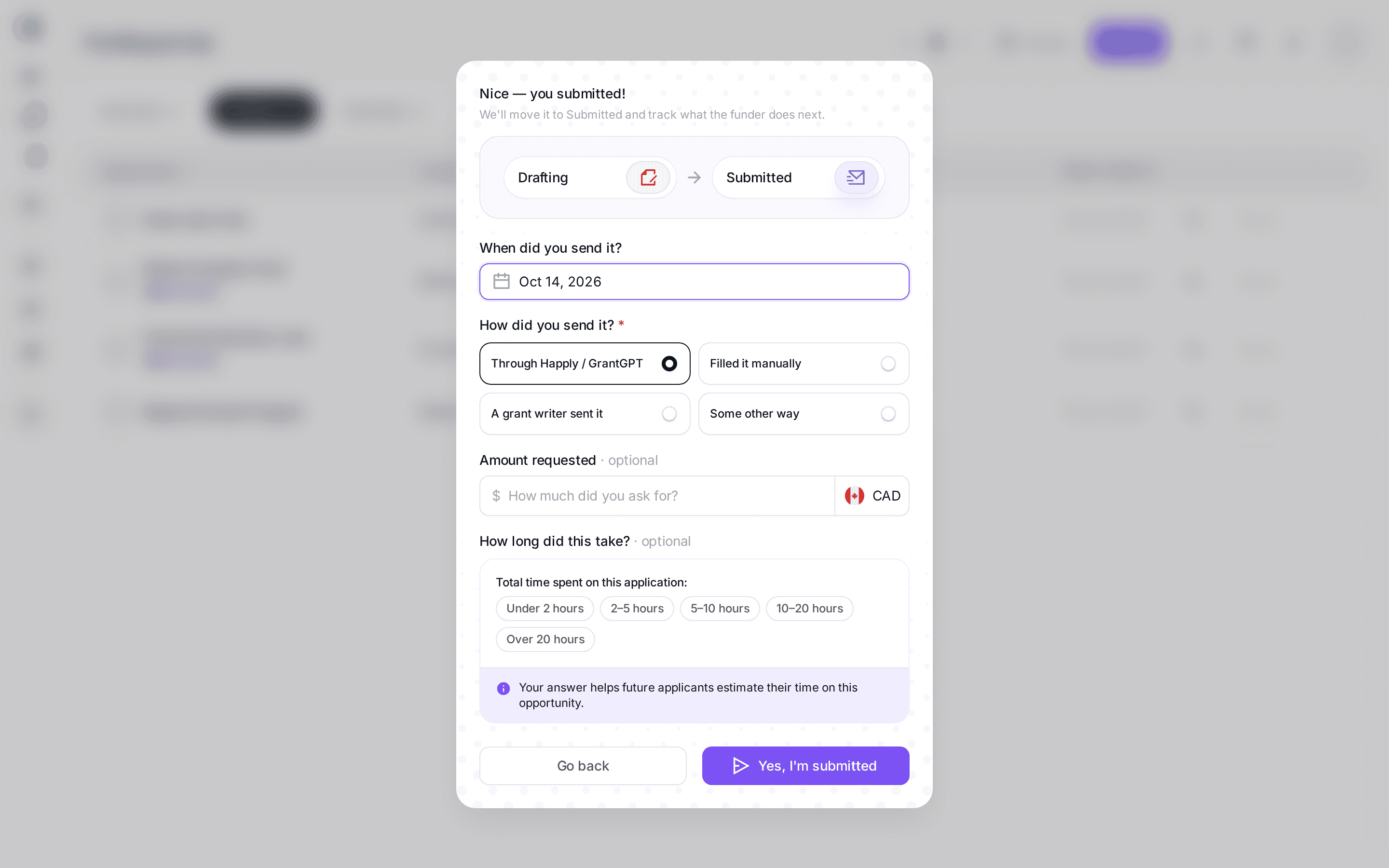
Every entry point opens this, with one required field. Demo data.

The pipeline as a table, one row per application. Demo data.

And as a calendar, for people who plan by date. Demo data.
Twelve programs saved in one afternoon
Without the rule
12 reminders
Deadline reminder
Deadline reminder
Deadline reminder
Deadline reminder
×12
With the rule
0, then 1
Nothing arrives
Then one moves to Drafting ↓
Deadline reminder
Without the rule, twelve saves are twelve interruptions. With it, the first reminder waits for the first draft.
What it changed
Reminders are scoped to items in Drafting or later, so a founder who saves twelve programs in an afternoon gets zero notifications until one of them becomes real. Every entry point opens the same capture modal, so there is one form to learn instead of three.
In review this was the rule the team pushed back on most and then adopted fastest. It is now the default for every new notification on the platform: earn the interrupt first.
What we said no to
Reminding people about everything they saved. It was the obvious engagement move and it came up more than once as a way to bring people back. We agreed to launch with silence for Interested and add reminders there only if founders ask for them.
A separate form for each entry point. Three ways in with three different forms would have meant learning the product three times.
Decision three: show money only when it is real
The problem
Grant programs advertise a ceiling. A program that says “up to $500,000” might typically award $40,000. When a platform adds those ceilings up and shows a founder their total funding potential, it produces a number that feels like a plan and is closer to a fantasy. And when someone actually wins, filling their win with the program maximum would be worse still.
A ceiling is not an award
$0
Advertised ceiling
Up to $500,000
A typical award
$40,000
To scale: $40,000 is 8% of $500,000.
The decision
The funding-potential total on the opportunity list is capped per opportunity, so a single outlier program cannot inflate a headline number that someone is making decisions against.
When an item moves to Won, the card records the actual award amount, entered by the person who won it. If they do not enter one, the card shows nothing. It never falls back to the program maximum.
And when an item moves to Not selected, we capture the reason, with an explicit “no reason given” option, because that is often the truth. Then we offer to create a linked item for the next cycle.
Two outcomes, two rules
Illustration, not a screenshot
Won
Award amount
Nothing shown
Entered by the person who won it. Never falls back to the program maximum.
Not selected
Reason
No reason given
Create a linked item for the next cycle
Neither outcome guesses: no award means no number, and “no reason given” counts as an answer.
Why
A made-up figure on a real win would be worse than no figure at all.
The rejection rule is the one I care most about. A rejection is the highest-risk moment for someone giving up on funding entirely. Turning it into a specific, linked next attempt is the difference between a product that logs an outcome and one that keeps someone in the process.

A win records what was actually awarded. Demo data.

A loss becomes a linked retry: the reason stays on the card, with Archive and Add feedback. Demo data.
What it changed
The funding-potential total is capped per opportunity, so one outlier program cannot inflate the headline number. A Won card shows the real award or nothing at all. Every Not selected item captures a reason and offers a linked retry for the next cycle.
The rejection flow is the part of the platform I expect to matter most after launch. It turns the moment people usually quit into a next step that is already on their board.
What we said no to
Pre-filling a win with the program maximum so the dashboard would show a bigger total. It was suggested because a large number feels motivating. A made-up figure on a real win is the fastest way to lose trust in every other number on the page, so the field stays empty until the person fills it.
Making the rejection reason required. People often do not know why they lost, and forcing an answer produces a made-up one. The explicit “no reason given” option is there because it is frequently the truth.
Identity beats filename
Applications fail on paperwork. The obvious solution is a folder where people upload files. A folder can only tell you what you put in it, and an application needs to know what you have not.
I designed the Document Library as a typed inventory instead. Every document has an identity: articles of incorporation, a T2125, a financial statement, proof of revenue. Forty-one types across six areas: Legal, Financial, Tax, People, Strategy, Operations. A file named final_FINAL_v3.pdf satisfies nothing until it has a type.
Once documents have identity, the library can do the thing a folder cannot: show you what you do not have. Missing types appear next to the files you own, labelled with how many of your active applications need them. Documents also go stale, so each type carries a freshness window, shown as a flag rather than a notification, because nobody needs to be told off by their document manager.
“The library shows what you do not have.”
A typed inventory
Illustration, not real files
41
document types across six areas
Legal · Financial · Tax · People · Strategy · Operations
final_FINAL_v3.pdf
Satisfies nothing until it has a type.
No type
Articles of incorporation
Typed
T2125
Typed
Financial statement
Past its freshness window.
Stale
Proof of revenue
Needed by your active applications.
Missing
Four states a document can be in. Stale gets a flag next to the file, not a notification.

The library: one folder per type, counted against what you keep on file. Demo data.

Missing types sit alongside the files you have, counted against the applications that need them. Demo data.
What it changed
The library can answer the question a folder cannot: what do my active applications need that I do not have yet. Missing types sit next to the files a founder owns, counted against the applications that need them. Stale documents get a flag, not a notification.
The typed model also became the contract the back end was built against. The 41 types and six areas I defined for the design are the same ones in the schema.
What we said no to
A plain folder with optional tags. Tags are optional, so most files would have stayed untyped and the library could never have said what was missing. Requiring a type at upload adds one step, and that step is what makes the rest possible.
Notifying people when a document goes stale. A flag next to the file says the same thing without telling anyone off.
Design, then build
By summer 2026 the design backlog was larger than three engineers could clear while still building the back end. So I moved from handing off screens to shipping them.
I worked inside the team’s existing front-end structure (Next.js, React, TypeScript, Tailwind, Radix), the same components, folders and conventions the engineers used, and built the UI with Claude as a pair programmer. One engineer and I split the screens between us. I designed a flow, implemented it, opened the pull request, and the team reviewed it like any other.
In five weeks, nine of my pull requests were merged: the dashboard redesign, the grant detail page, the Funding Journey empty states, the whole Document Library (upload, attach, folder pages, search), the auth pages and onboarding wizard, and Discover, a multi-turn chat with H, the platform’s assistant, including its motion.
The rule I set for myself: I do not change the architecture, I ship inside it. That kept my code reviewable and kept the engineers’ trust. It also meant the design system stopped being a Figma file and became the component library the whole team pulls from.
From approved design to code
Illustrative lengths
Before · screens handed off
A sprint
After · the same states, already in the components
Days
Inside the team’s stack
Next.js, React, TypeScript, Tailwind, Radix
Design QA became a diff, not a screenshot comparison.
What it changed
The gap between a design being approved and being in the codebase went from a sprint to days. Engineers stopped rebuilding spacing and states from screenshots, because the states were already in the components.
Design QA became a diff, not a screenshot comparison.
What we said no to
Me building whatever I wanted in a separate codebase. It would have been faster for a week and a maintenance problem for a year.
Skipping code review because the author was the designer. My pull requests went through the same review as everyone else’s, and that is why they were merged.
The other half: HapplyOS
Everything above is the founder’s side. The same platform runs white-label for the organizations that fund them: members, applications and review, roles and permissions, courses, events and reporting. Each client gets its own brand, domain and rules on one codebase.
I designed that side too, and it is a different set of problems, so it has its own case study.
happly.ai
I redesigned and built the marketing site in Framer, with its own design system and motion. It is the one part of Happly that is already live.
happly.ai, desktop and mobile
Designed and built in Framer.
What it changed
Engagement went up 170 percent after the redesign. The site has its own component system in Framer, so the marketing team ships new pages without a designer in the loop.
It also became the visual reference for the product. The type, spacing and colour decisions on happly.ai are the ones the platform design system inherited.
What I would do differently
I would have pushed harder, earlier, for instrumentation. Most of the decisions on this page were argued from user conversations and product logic, and they hold up, but I had to make the case for several of them more times than I should have because I could not point at a number. That is a design responsibility, not just an analytics one.
I would also have written things down sooner. The decisions that stuck are the ones I wrote as rules before anyone drew a screen, and the two documents I wrote that way, the Funding Journey and the HapplyOS overview, are still the reference the team works from.